The popularity of podcasts in terms of passing a word effectively is on an exponential rise. However, the proven success that podcasts come alongside along with the effective platform it provides to interact with people increases the competition in terms of a perfect podcast creation too.
Hence, it’s necessary to be absolutely spot-on with your podcast. A perfect podcast artwork design is one of those areas that you need to nail in order to ensure that your podcast looks professional, and actually keeps on gaining new listeners.
Yes, looks do matter, and with podcasts, the importance of looks increases to a good extent. Now, let’s address the question, “how do you nail the podcast artwork design?“. It’s not that difficult, but you need to be right with a lot of things in order to nail the podcast artwork design.
I have listed some of the best ways or say tips to ensure that you ace the game of podcast artwork design, and that your podcast simply looks amazing.
Also Read: Top 10 Best Podcast Cover Art Maker Tools to Design Podcast Cover
Contents
- 10 Podcast Artwork Design Tips to Create Podcast Artwork like a Pro
- Frequently Asked Questions About Podcast Artwork Design:
- What makes a good podcast artwork design?
- Can I change my podcast artwork design after the podcast is launched?
- What is the ideal format for podcast artwork design?
- How do I make my podcast reach a large audience?
- What things should I include in my podcast artwork design?
- Is podcast artwork design a mandatory thing?
- The Pro Review from TechReviewPro
10 Podcast Artwork Design Tips to Create Podcast Artwork like a Pro
Go through some of the most useful and effective podcast artwork design tips below.
1. Know Your Audience
This is the first and the most important thing you need to do if you desire to nail your podcast artwork design. Creating a listener persona is one of the best ways to understand your target audience well.
Now, what does listener persona mean? The listener persona is simply a profile of your target audience. You need to include basic information like gender, age, occupation, target location, etc. in this profile.

Here, you need to be very specific. Being generic won’t do any good to you or your podcast. Just think this way, wouldn’t being generic divert you from your goal of making an impression among specific people, as you would simply overdo things to make your podcast look amazing for everyone?
What makes building a listener person so important for you? For instance, a particular color scheme might go well in the UK, while that color scheme might not impart any good effect on the people of the USA. Same way, kids might like bright colors and a bit of busy design, while business professionals would prefer to go with simple and formal design.
You simply need to be right with ensuring that your audience gets the podcast the way they want, and for that, building a listener persona is a must. Do your research, know things well, know your podcast genre well, and create an effective listener persona.
2. Nail the Content
Well, content is not only about the message you deliver to your target audience. But, those few words that you use on cover art matter too. You might be wondering about the correlation between content and the visual representation of your podcast, but it’s content that would make your listeners listen to the entire podcast.
If you keep the content right, stay right with the tone, style, etc., and make sure that the content on your podcast cover makes your listeners feel involved and engaged.
Use a few yet effective words. Remember here, less is more. Make sure to make your content match the images you use on the cover art. It must not beat around the bush by any means. Also, make sure that the content doesn’t make people keep wondering what your podcast is about. It must be clear, and crisp, and give people clear information about your podcast.
Again, the listener persona that you created in the first step would be useful here. It would help you to use words that might impart a positive effect on your target audience. For instance, if your podcast is of the business genre, you can go through an option like Motley Fool to see how to deliver the content effectively.

3. Be Right with Dimensions
Next, you need to ensure that you stay right with the podcast cover art dimensions and that you actually meet the requirements catering to every class of device.
Remember, not every device would demand the same dimensions, and hence, you must know the specific requirement and make your podcast cover cater to the same efficiently.
The artwork dimensions must be at least 1400 x 1400 pixels in either JPG or PNG format. From Apple’s point of view, the dimensions must be 3000 x 3000 pixels, and the resolution must be 72 dpi.
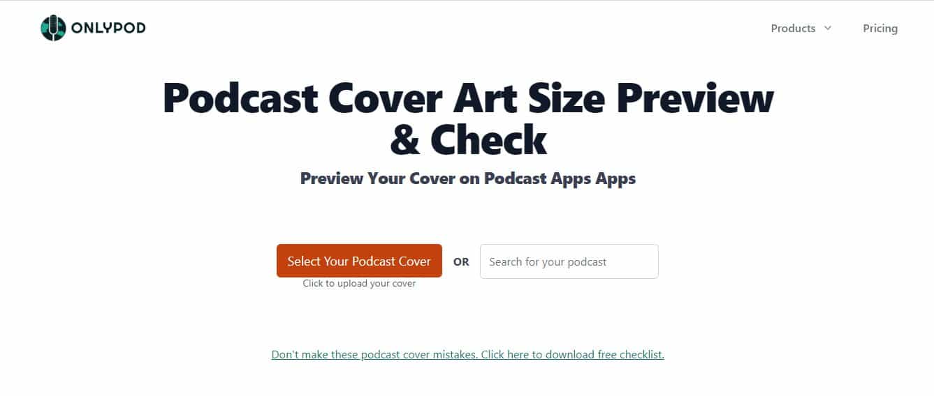
Remember, use only JPG or PNG file format. You can use tools like Canva to adjust the size and resolution of your podcast artwork without losing quality even a bit. You can use a tool like OnlyPod to preview your work and verify that the dimensions are right.
4. Be Right with Colors
I wish I could stress the importance that colors come alongside them for podcasts. As mentioned above, color selection depends on a number of factors. You can’t use bold colors everywhere, and at the same time, bright and mild color options too, don’t go well everywhere.
The way your audience receives your message depends a lot on the colors you choose. For instance, if you are targeting businesses, light and analogous colors might be your ideal choice to go with. At the same time, if you are targeting kids, bold and a combination of several colors can be your ideal choice to go with.
You can explore the podcasts of various brands, and see the color patterns that they have used. Remember, the color will define the traffic on your podcast to a good extent. Hence, give yourself considerable time in terms of selecting the right color for your podcast.
5. Don’t Forget Consistency
Consistency is one of the most difficult things to maintain when it comes to podcast artwork. Be it the brand’s logo, color schemes, text, fonts, etc. you need to be consistent with every aspect of the podcast and ensure that your brand is represented clearly.
It’s easy to get out of the consistency track as there are a number of things to do, and podcasters often fail to stay on the same page throughout. Make sure to use the same logo and the same pattern of things that you use on your website and social media. The more you stay consistent, the easier it will be for you to make your target listeners trust your brand’s podcast cover.
6. Avoid Overdoing Things
Overdoing things won’t simply take you anywhere. With podcasts, less is always more. For instance, overuse of images would simply make the entire cover busy and your target audience would simply get turned off here.
Also, avoid complex images and text. They simply don’t make your users feel curious. Keep content short, simple, and crisp too. Avoid anything like tough-to-understand words. Ideally, content on the podcast artwork cover must be five words or fewer, and not more than three colors should be used on podcast artwork.
Numerous podcasters tend to use a lot of images, which ultimately degrades the chances of their podcasts being liked and listened to by a large number of people. It simply doesn’t give the users those vibes of engagement, which plays a massive role in terms of looking for better options than your podcast.
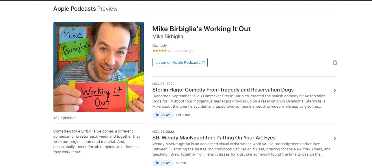
For instance, I loved the simplicity that the podcast Working It Out, comes alongside. Not too many colors or heavy design is used, but it’s quite clear and crisp.
7. Be Right with the Image Types You Use
Yes, being right with the image type is the next most important thing that you need to nail. Do you desire to go with a drawing-type image or photo? The answer to this question largely depends on your business domain and the class of your target audience.
Also, the podcast genre plays an important role in terms of determining the image type to be used in the podcast artwork design.
Ideally, the image you use for your podcast artwork design must summarize your podcast. But, you can choose the theme and image that leaves users wondering and gives birth to the seeds of suspense, of course, depending on your podcast domain.
8. No Explicit Language or Images
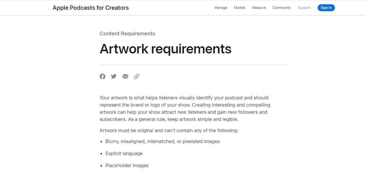
Your podcast must not violate the podcast guidelines by any means. Avoid using any sort of explicit images or language in your artwork. Using them might turn off your users and even bring serious consequences for you, as your podcast violates the guidelines.
Avoid any sort of nudity, or curse words on images or content. Make sure not to make fun of or disrespect other podcasters, directly or indirectly. Also, don’t promote violence or anything like drug or alcohol use by any means on your podcast artwork.
Your podcast artwork along with describing your podcast would describe you as a person too. Hence, make sure to keep it clean, friendly, and relevant.
Even if your podcast is marked as explicit, it must be censored before it reaches your target audience. Be it Apple Podcast, or Google podcast, know the guidelines well, and make sure not to violate them by any means.
9. Research Your Competition Well
Researching your competition gives you a clear idea of what works well with your podcast genre, and what doesn’t. Of course, I am by no means advising you to copy them. But researching your competition would help you figure out the bases that they haven’t covered. You can nail them and get an edge over them.
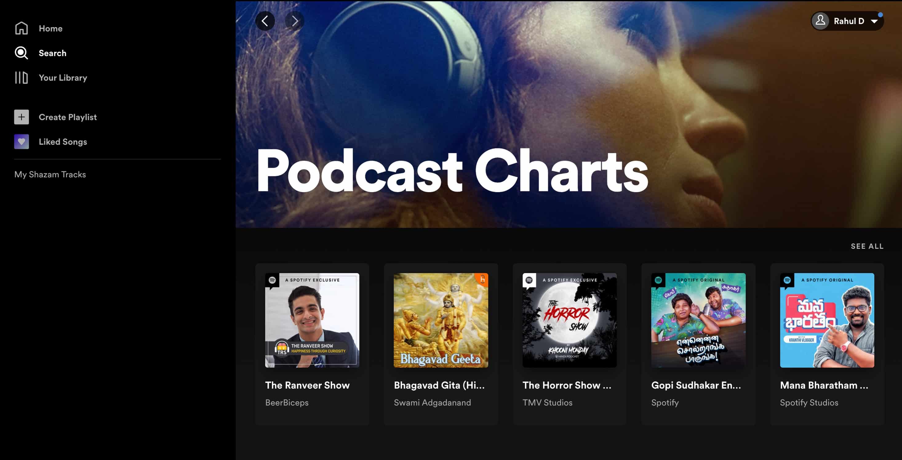
The more efficiently you research your competition, the easier it will be for you to cover the uncovered and important bases in your podcast artwork design, and provide your audience with something new and unique.
10. Have Fun
Lastly, it’s important to have some fun with podcast artwork design. After all, what’s the point of working if you aren’t enjoying it, isn’t it? Do take some risks with your podcast artwork design, keep trying new things, and use your creativity to the fullest to nail the podcast artwork design.
You might not believe it, but having fun while you go with podcast artwork design actually increases the chances of it being amazing. Hence, just take things lightly, have fun, take risks, and just make sure that you stay within the podcast guidelines. Rest, you are all good to go.
Also Read: Top 6 Best Free Audiobook Apps for iPhone and iPad
Frequently Asked Questions About Podcast Artwork Design:
What makes a good podcast artwork design?
Relevancy, the right dimensions, crisp content, and staying within the guidelines are sufficient aspects to make your podcast artwork design amazing.
Can I change my podcast artwork design after the podcast is launched?
Yes. You can always modify your podcast artwork design after the podcast is released. However, try to design it such that no modifications are required at all. Take your time, but try to keep it a one-shot effort.
What is the ideal format for podcast artwork design?
JPEG or PNG are always ideal formats for podcast artwork design. However, you can choose any other format depending on your preferences and requirements. Though, I recommend either JPG or PNG.
How do I make my podcast reach a large audience?
Firstly, make sure to nail the podcast artwork design. It would impart a positive psychological impact on a person. Then, a podcast trailer is always a good way to attract the audience. Then, use a solid CTA to make people take the actions you want.
Lastly, promote your content efficiently on social media platforms. If your podcast is really good enough, attracting a large audience won’t be difficult for you by any means.
What things should I include in my podcast artwork design?
Ideally, your podcast artwork design must include a brand logo, tagline, and images summarizing your podcast. Also, content of fewer than five words is highly recommended. It could be either CTA or something that describes your podcast. I usually recommend CTA in your podcast and not on podcast artwork design. But, it is a trend, and if you desire to go with it, you can!
Is podcast artwork design a mandatory thing?
No, podcast artwork design is not at all a mandatory thing, but it’s highly recommended. The right podcast artwork design can impart a positive psychological impact on a person’s mind, which is a massively good sign for your podcast. Hence, investing some effort in podcast artwork design is absolutely worth it.
Also Read: Top 10 Best Android FM Transmitter Apps for Free
The Pro Review from TechReviewPro
Podcast artwork design can be a bit challenging, but keeping it simple, being a bit patient, and nailing the research part would make things easy for you to a considerable extent.
Podcast artwork is all about that important first impression, which makes it important for you to nail this aspect. The above tips would definitely make it easy for you to nail your podcast artwork design.
Are you all covered about your podcast artwork cover design? Or do you require any more tips or assistance from my side for your podcast artwork design? If yes, do comment down below, and I would be more than happy to assist you.
Related Resources:
- Top 7 Best FM Radio Apps for iPhone to Listen to Radio on iPhone
- Top 10 Best Book Cover Maker Apps and Tools to Design Amazing Book Covers
- 31+ Best Free Graphic Design Software to Create Stunning Graphic Visuals
- Top 10 Best Poster Maker Apps for Making Amazing Poster Designs
- Top 10 Best Flag Template Design Makers to Make Your Own Flag Template Design


